Your logo is important. This is an obvious fact, but did you know that if your logo isn’t up to standards, it’ll lag behind the competition. Your logo should be designed with a purpose, not just some text and shapes. When your logo appears on everything that talks about your business, from letterheads to your website, you need it to convey the right message. Here are a few good sticking points to keep in mind:
Start The Process Right
Before setting down to just start drawing up plans for your logo, take the time to examine what you want your design to do. Who is your audience? What is your product or service? Where will it be displayed? Whether you’re designing for your own business or a prospective client, it’s crucial to not get too ahead of yourself. Starting with a clear direction for the design keeps you on track and avoid trying to do too many different things and getting away from the original purpose of the creative brief.
Don’t Complicate Things
If you’re starting from scratch with a logo design, you might be tempted to put tons of information into it. The thing is, most logos that appear in the top corner of websites, on envelopes, or letterheads can fit within the size of a postage stamp. You won’t be able to get tons of detail visible on it, and there’s only so much information you can reasonably get into hat space and maintain clarity. A simple and direct image that can be recognized as yours goes a long way for when it has to shrink down.
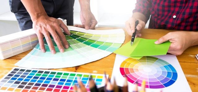
Be Recognizable
If your logo uses the same fonts and imagery as every other business in your field, it’s hard to stand out. Using unique layouts and colors can help you stand out from the crowd. Don’t go too crazy though. If you try to do too much with a logo, potential customers might be confused about what you do or think you’re trying too hard. Both are the opposite of what you want!
Go For Longevity
Sometimes it can be tempting to add a popular cultural reference into your design. The nod to everyone showing that you’re in the know sounds like a good idea, but resist the urge. Locking your logo to a particular point of time when something was popular will not go well in the long term. You’ll either have to redesign soon, or risk looking outdated to your customers. Using a timeless image or basic shapes make for some of the best logos.
Make Sure It Can Travel
Your logo is going to be in a lot of different places. Mail, website, business cards, maybe even t-shirts, pens, or bumper stickers. Your logo should look like it belongs on anything you put it on. That means keeping the colors and design simple and clear. A monochromatic color scheme (usually black and white), crisp lines, and unambiguous connection to your business. Your logo should be obviously yours even if people don’t see the full design.
Save It As The Right Kind Of File
One of the difficulties with making sure your maintains quality and can be easily applied to various locations is keeping it saved in a widely used file type. In reality, you should actually save it as several different file types. For web formats, PNG is a typical go-to, while PDF is commonplace for print. One absolutely necessary step is to save the file in a format that can be edited easily. If your logo has layers and was created in Photoshop, GIMP, or something similar, save and keep that file for quick edits. Nothing brings a project to a grinding halt like having to redesign your whole logo so you can make one small change.


Nice post although I’m pro level logo designer but its good content for any beginner