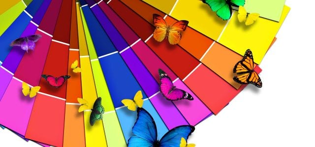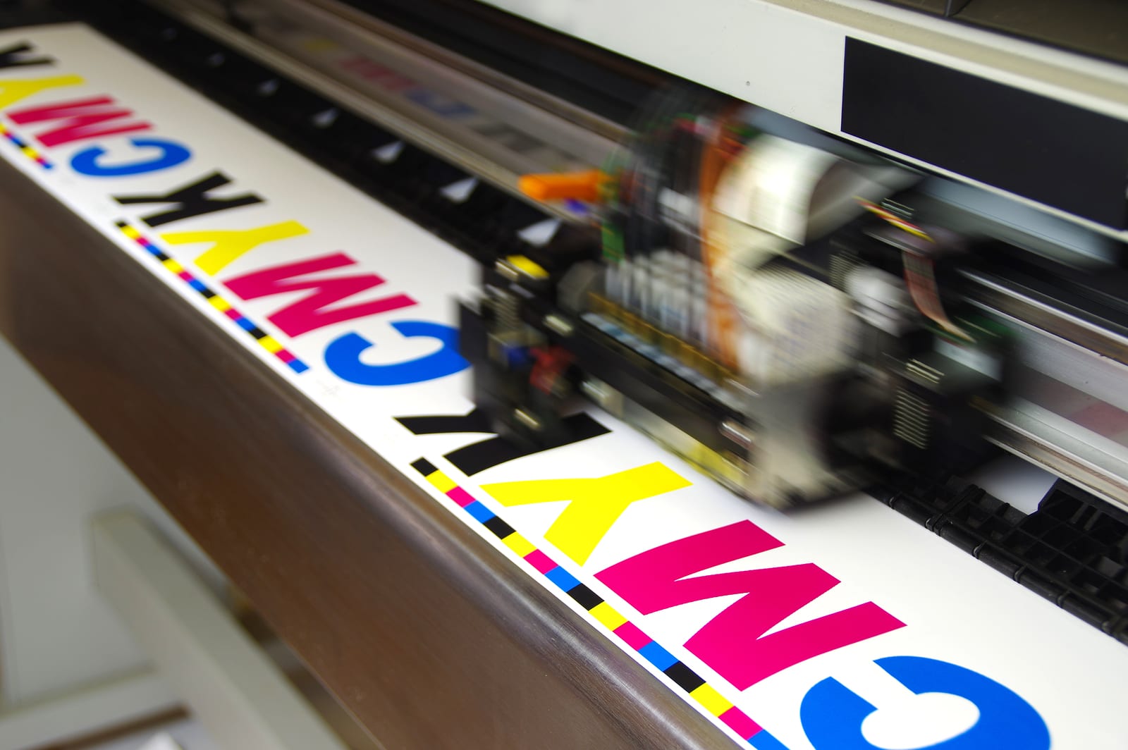
When it comes to print colors, it goes without saying that there are countless options for what colors can be used. Often when it comes to designing mailers and other print sources, CMYK is the color palette of choice. CMYK stands for Cyan, Magenta, Yellow, and Black.
What is the difference between CMYK and RGB?
Most people know about RGB (Red, Green, Blue) as a color palette. By using those three colors, many others can be mixed and displayed with an additive process. This is primarily used in digital mediums as displays often have the ability to display those colors.
CMYK uses subtractive process for colors. Instead of adding colors together to create new tones, it removes colors from the equation to generate new ones. The other colors are able to create fantastic and vibrant shades, and the black is added to create deep and moodier colors.
Because RGB is used for digital displays and CMYK is used in print, there can sometimes be discrepancies from what is displayed on screen and what comes out of the printer. Because of the different processes for both CMYK and RGB, CMYK is best used for printing on white surfaces.
How Can You Use CMYK?
Whenever you are designing something for print, CMYK is usually the best choice. The reason why CMYK is better for print is because the paper is already white, and is just shaded by the ink to create darker colors.
This requires a bit of thinking ahead because, as previously mentioned, computer screens display in RGB. Using printed color wheels, established CMYK color combinations, and experienced designers, it’s possible to still design with computer programs even when it isn’t displayed properly on screen.
You can set your color palette to CMYK when using design programs such as Photoshop, and then use percentage combinations to maintain consistent colors, so that even if the display is different from screen to screen, the color will always be the same.

For example, this orange color can be expressed by stating what percent of each color. The color is shown by C 0% M 27% Y 48% K 13%. This means that of the total possible Cyan that can be present in this color, 0% is being used, 27% of Magenta, 48% of Yellow, and 13% of Black. By adjusting these percentages, you can create a totally new color.

By cranking the Cyan up to 80%, you can make this more deep aqua shade. Notice how the color is darker than before? That’s because the added colors makes it absorb more light. That comes into play when trying to make the darkest colors possible.
What Is CMYK Black and Photoshop Black?
In the world of printing and design, black isn’t always black. When trying to create a “rich” and “full” toned black, other colors are added. This works by adding more color to the black so that it absorbs more light and is known as Photoshop Black. This requires more ink because other colors are involved.
CMYK Black is when no other colors are added and the black is left to stand on its own. While this may not be quite as impressive and deep as Photoshop Black, it gets the job done. It also uses less ink and is less likely to soak the medium that it’s being printed on.
How Do You Decide What To Use?
Unless you are a color expert, choosing the right color scheme for your design and printing project can make it nearly impossible to decide. That’s why the professionals at RTC are here! With over 30 years of experience dealing with the different ways of designing and printing projects, our experts are the best at what they do. Give us a call for your next design project!